Dubai Tourism
We have had the opportunity of working closely with Dubai's Department of Tourism & Commerce Marketing (DTCM) for over 8 years across a host of brand and digital initiatives - ranging from a national brand, microsites to multilingual productions telling the story of Dubai to government bodies, events and professional organizations around the world.

THE OPPORTUNITY
However, in 2009, we were invited to redesign and develop the tourism body's official website. We realized it had two distinctly different set of audiences -- investors, government bodies, hotel chains and on the other hand, it was also mandated to be the single channel for all tourists and visitors to the city. We deduced there was a much deeper conflict in Dubai's official tone of voice that couldn't simply be solved with a revamped website.
OUR APPROACH
With no clear cut brand architecture or system, we saw an opportunity to clean up and reimagine the brand structure of Dubai's many faces when it came to tourism. Although contracted to simply rebuild the website, we proposed a reimagining and streamlining of the Dubai's brand identity, with the possibility of a new logotype and launch campaign. We managed to convince them and were commissioned to first tackle the brand dilemma prior to the website.
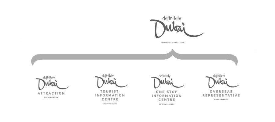
We started by benchmarking Dubai's latent brand recognition against its global counterparts, both cities and countries. After dozens of conceptual ideas, each rooted in a singular facet of Dubai, we eventually conceived a new holistic brand to sit within DTCM's official family of brands. As part of the exercise, we developed an architecture of all tourism initiatives within the government department's remit and built a compelling storyline to be amplified across all its touch-points.
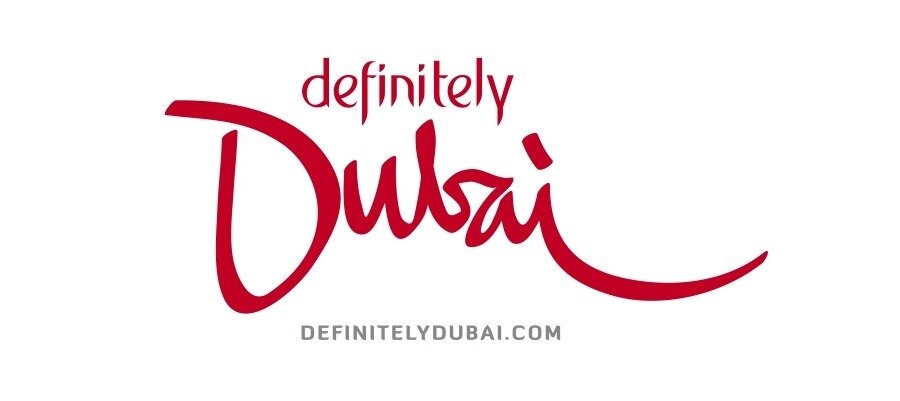

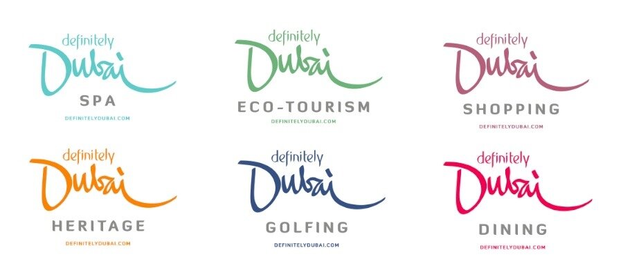
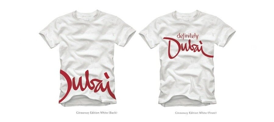
NEW IDENTITY
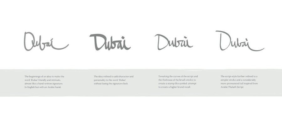
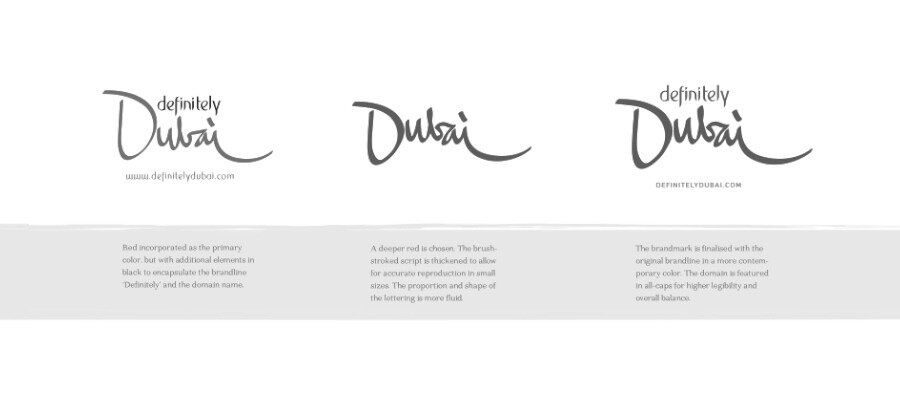
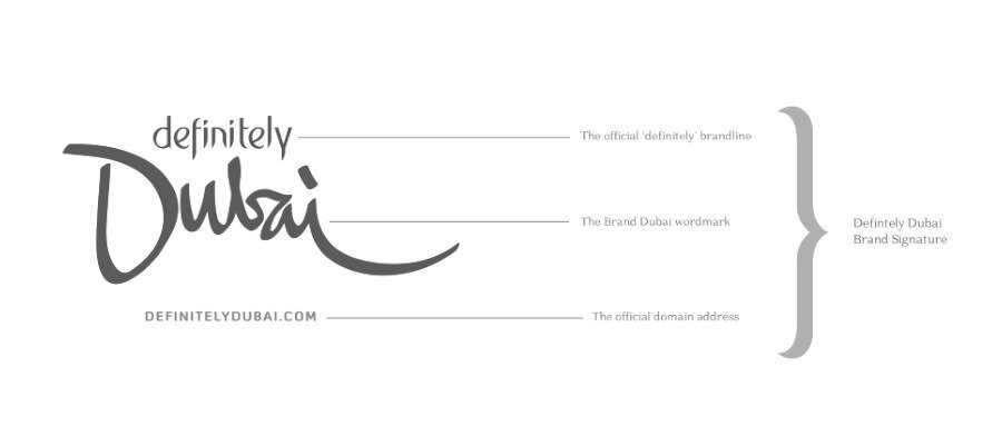
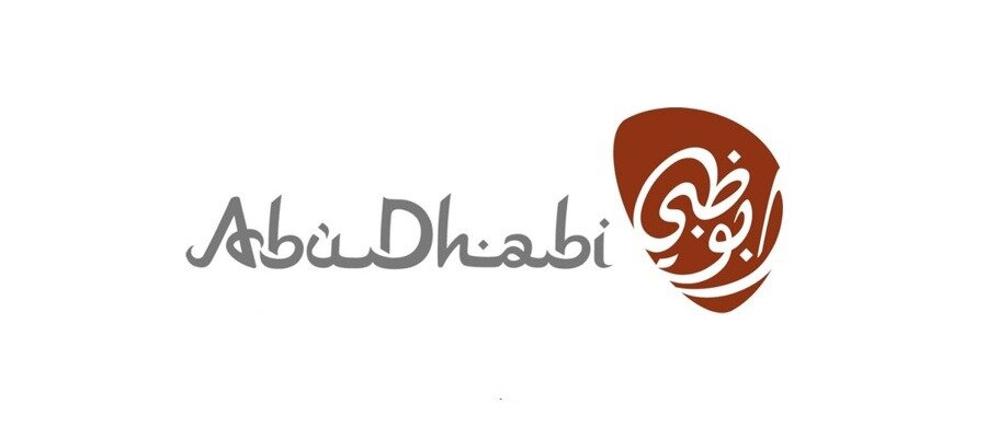
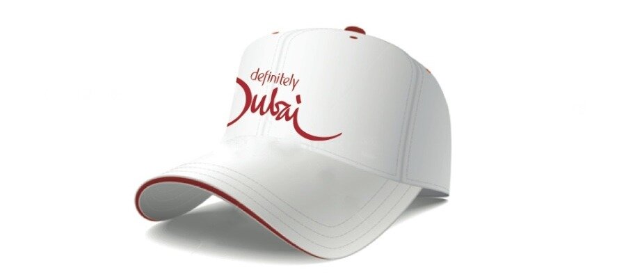
A new logo and identity system was the natural progression of the realigned brand strategy. An original typeface was created to illustrate the word 'Dubai' -- inspired by the Arabic 'thuluth' script, using Arabic brush strokes to form an English word. A tone of deep red was chosen as the primary color of the logo marks. The prefix 'Definitely' was created with the objective to help launch the new identity and provide it with context. We have built a 'living brand manual' that continues to evolve with time.
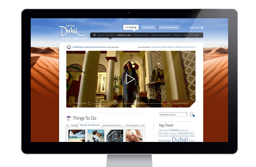
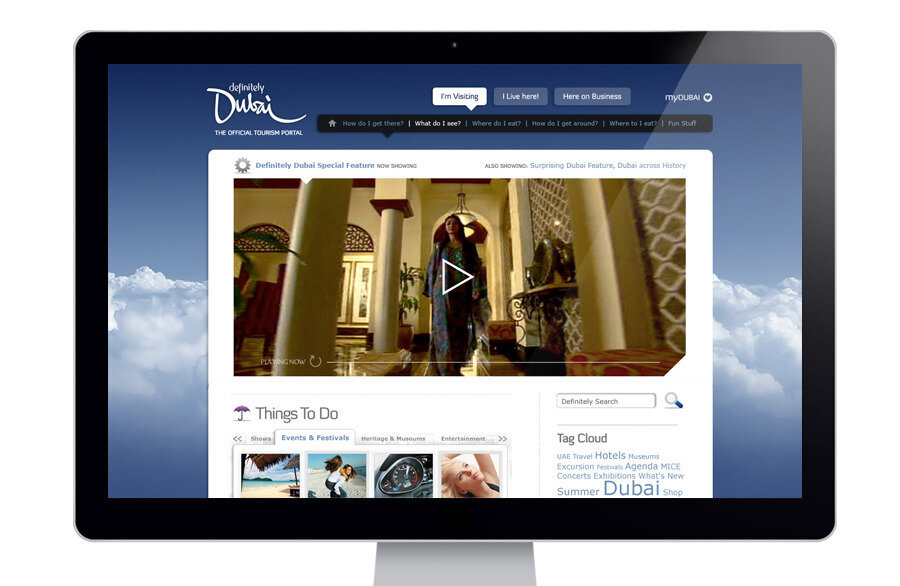
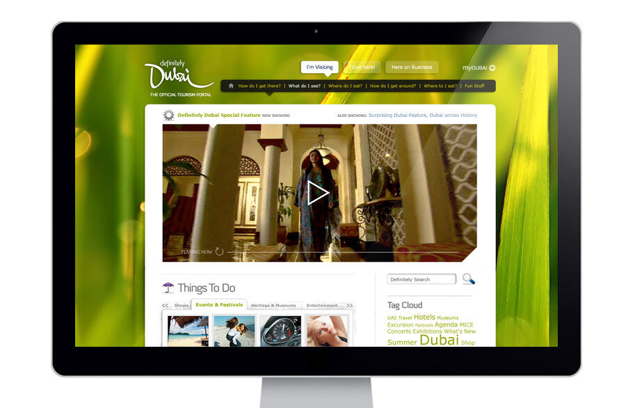
DIGITAL DESTINATIONS
Digitally, one of the most wide-reaching tools for the new brand story was no doubt going to be the new destination website. We conceived, designed and developed the entirely new DefinitelyDubai.com. A simplified and more B2B design sensibility was adapted for our visual direction and website for the government department. Full project details may be found here.